
This secret door in the woodwork of The Winchester House conceals a steep, slightly twisting, staircase leading to … wherever. A banister is helpfully provided.

This secret door in the woodwork of The Winchester House conceals a steep, slightly twisting, staircase leading to … wherever. A banister is helpfully provided.

 Green Kirtle = green scales = reptile = poison = poisonous intent, poisonous sexuality, poisonous philosophy.
The Green Witch is all about poison. Green-yellow is the color of pustulence, of unhealthy phlegm, pus, the eruptions of an infected wound; it’s the color of insects, snakes, lizards, certain larvae, caterpillars, and amphibians, and centipedes. Creepy-crawlies that in the majority are not poisonous, yet you wouldn’t want to touch them. It’s wise to err in caution. Green is the color of unripe fruit that might irritate the stomach. Being so symbolized with poison, it’s no wonder The Green Witch gets such a poisonous, messy death.
The power to bewitch men is evident is evident in the Tarot card image above and in the Roberto Ferri painting to the left, which I had to judiciously crop because of explicit male nudity and stuff. Neither is the Green Witch, but they could be.
 OTOH, if it’s a comic version you want, the pic above, of some Pokemon creature, will fulfill that role. Save for its dolorous expression.

Digital art by Alon Chou
This isn’t the Lewis character either, but her clothing is spot-on.

Francesca and Her Lute, by Charles Edward Halle
The woman playing the lute here is closely aligned to the Green Witch in her pre-Raphaelite aesthetic. I always pictured the witch’s eyes as large and luminous as those of the woman’s in the painting, seemingly innocent, yet full of lies.

Character design by Olga Prozorova
If The Green Witch had ever become Queen of Narnia, she might have looked like this. Notice the smug expression.

Queen of Wands, by Elric2021
This is about the nuttiest Green Witch I’ve come across. It’s some kind of photo collage, like those Lavazza Coffee used to do for their annual calendars, and resplendent with sunflowers, green and brown brocade, and a Narnian lion throne and tapestry. The Queen is as regal and royal as a figure from a Tudor portrait, where the subject’s head is too small and hands too large. She’s part of a Tarot deck, where images of witchy women abound. In fact, there’s even a whole deck of them, The Green Witch Tarot. To be a Green Witch has positive connotations in the present day; yet Lewis, through his skill, displaced his villainess from the healthy associations with nature, associating her with dark, hidden places — a spring that comes out of the earth, a snake’s burrow, the Underdark,

This creature might be the female version of The Green Man, a stock mythological being representing the return of spring and new plant growth. But she has her hair styled in two horns, which might allude either to a Medieval headress or Batman’s enemy Poison Ivy, who is also a Green Witch of sorts, drawing her power from plants and mesmerizing men with mind-controlling pollens and poisons. Like Poison Ivy, the Green Witch uses a powder to beguile and hypnotize, and her power comes from poisons. They are the anti-Green Man.

Jadis, by Otenba-bekki.
 |
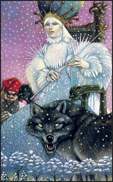
“Long, long ago, at the very beginning, a White Witch came out of the North and bound our land in snow and ice for a hundred years. And we think this may be one of the same crew.” |  |
This throwaway quote by an anonymous owl in The Silver Chair made me think. Its casual use of “crew” implies Narnia was plagued periodically by these wicked women, who had nefarious plans and were dispatched before their plots came to full fruition, and yet went unrecorded in Mr. Lewis’s chronicles of the place.
Well? What do you think?
Some randomgenned witches who might have followed in Jadis’s footsteps.
| Serena Winter, the Cold Spellmistress
The Invisible Sorceress of Salvargaunt Glacier The Arctic Enchantress Invilgra the Ivory Witch Wynnrhin, the Witch of the North Star Shinwraith of the Silver Sash The Wolfsilver Witch The Crystal Harpy Mistress of the Pale Yellow Sapphire Lady Frozen Flame The Witch-Queen of Black Ice Mountain Mischa of the Furred Capelet Jinsapha the Pale-fingered The White Opal Sorceress |

Mr. Tumnus pauses near the lamppost in this pen and ink illustration by Masianus Andrzej, which resembles a Victorian engraving.

One of the ways The Voyage of the Dawn Treader movie differs from the book is the role the Seven Lost Lords play. In the book, the lords, who opposed Miraz the Usurper, are exiled and depart on a sea voyage to explore the east, only to disappear; they are the impetus for Caspian to make his own voyage to find out what happened to them.
In the 2010 movie, the lords’ exile brings them first to the Lone Isles, where they hear of a mysterious Green Mist (a movie invention) ** that is kidnapping people and swear together to destroy it. They travel to Coriakin’s island where the wizard tells them their swords, grouped together at Aslan’s Table on Ramandu’s Isle, are the key, but the mission fails before they can reach it, and so Caspian must pick up the task. It’s a nonsensical plot twist that destroys the Pilgrim’s Progress feel of the original book, turning it into a run-of-the-mill adventure with a big epic battle at the end between dragon and sea serpent. Which was all WRONG. Really, a dragon vs. a sea serpent? Roast unagi sushi anyone?
I prefer the book version, in case you haven’t guessed.
Not much is known of these lords, and no one in Caspian’s party mourns the two of them who died in horrific ways: Restimar, who leapt, naked, into a pond that turns things into gold, and Octesian, who was either killed by a dragon, or turned into the old dragon that Eustace-as-dragon later *ate.* The moral and gustatory complications of which Lewis never explored with poor Eustace. I mean, if I was turned into a dragon that later ate a dead dragon, who used to be human, I’d be pretty nauseated and/or upset about it.
Lord Restimar’s demise differed slightly in the movie, where he was depicted as clothed gold statue who had gone down on one knee to touch the water. In the book, he was naked, having jumped in.

Movie Restimar.

Book Restimar. The text says he dived in with his arms above his head, but let’s imagine here he undressed, stepped in, and started to wash his face.
As for the other lords, fortunate Lord Bern retired from the quest at the Lone Isles and was portrayed sympathetically. Rhoop was trapped in the shadows of Dark Isle and later received mercy at Ramandu’s Isle, where the remaining three lords had fallen into an enchanted sleep. Rhoop joined them, and they were restored on Caspian’s return.
To give the Telmar lords some personality I randomgenned seals/crests for them that sync with their later adventures. Because the Telmarines were afraid of the sea, the forests, and didn’t believe in mythic creatures, those elements are not present.
| Bern: Three green shamrocks separated by diagonal bars
Octesian: Four interlocked octagons in different colors Restimir: A golden comet between two oxen Rhoop: Shield against a purple cloud Mavramorn: Wolf’s head surrounded by twelve swords with their tips pointing inward Revilian: A lance above a lily on a field of blue Argoz: Crossbow inside an inverted triangle |
| The two sneaky guys who betrayed King Miraz
Glozelle: A snake and a flame separated by a green diagonal stripe Sopespian: A bonfire on a background of scarlet and white stripes
Other Lords Belisar: Scarlet fern frond on a field of white Uvilas: Gloved hand holding a hunting horn Arlian: Full moon on a dark blue background surrounded by four silver stars Erimon: Elm tree and a golden ewer Passarid: Songbird above a yellow trillium flower, on a russet background |
** The Green Mist was to serve as a tie-in to the next movie of the series, The Silver Chair, where it is discovered to be an invention of The Lady of the Green Kirtle. That movie seems to have been put on hold.

![]()
Above: Aslan in a 1960s style. Below: Narnia logo in Arabic script, by mohammedanis-dacttw1.

thrum – thrum – thrum – thrum
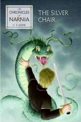
The Lady of the Green Kirtle, sometimes known simply as the Lady, is the second major villain of the Chronicles of Narnia. She plays a star role in The Silver Chair, where she is responsible for killing Caspian’s wife and abducting his teenage son Rilian, using him in her plans for conquest. As I said here, she never got a proper name. I’ll call her the Green Witch for the purposes of this article.
In her illustrations for the book (one of which is pictured above) Pauline Baynes depicts her as anodyne, her expression sickly-sweet. That was part of the witch’s power, of course, to appear saccharine and harmless. She wears a long flowing Medieval gown, bright green in color, with wide scalloped sleeves. Plant sprigs surround her and adorn her hair; but they, and the green color, do not represent spring and new growth but poison and malice. Perhaps the plant sprigs are mistletoe, used as a poison by the druids. Whatever the plant is, it’s an invention of Baynes and not in the text.
Like Jadis, the Green Witch uses magic; but where Jadis is/was a Mage-Queen, the Green Witch is an Enchantress. She’s more overtly sexual than Jadis (even as Lewis did not get explicit about it) and uses her powers of physical attractiveness, beguilement, and disingenuousness to pursue her goals. As Jadis was based on the fairy tale character of the Snow Queen, the Green Witch is the La Belle Dame sans Merci, an alluring, magical maiden who causes chaos by toying with a knight’s affections, bringing him to self-destruction.

La Belle Dame sans Merci, by Frank Dicksee
This deadly lady was a popular subject for pre-Raphaelite painters, such as Frank Dicksee, who painted the above. I’ve always loved this picture. It’s so trite and silly, yet erotic, the way the woman, sitting sidesaddle on the knight’s charger, leans down to sweep the knight with her mane of long red hair, and he glances up, startled, the two round chest protectors by his armpits looking like aroused nipples. He’s flushed with excitement, while she is cool as ice.

The Kiss of the Enchantress by Isobel Lilian Gloag
This picture shows another alluring enchantress from the same era as she transforms into a serpent. As the knight succumbs to her kiss she begins to wrap her tail around his leg, trapping him, and reaches for his hand with a long, pale arm. But he fists it tightly, showing the viewer his resistance to the spell. This encounter could go either way, with him either being seduced, or breaking free.
The artist, Isobel Lilian Gloag, was one of the rare female pre-Raphaelites and I think this gives her watercolor more nuance. The witch’s desire here seems equal to the knight’s, but it may also kill him, by those coiled, thorny branches that sprout up by her tail, and I wonder if Lewis had seen this image somewhere and based the Green Witch on it.
Baynes’ illustration of the witch’s transformation is, interestingly, more into water creature than snake, going by the creature’s fins. She looks rather like an oarfish. Her tiny, narrowed eyes convey hate, and Lewis reveals some old fashioned courtliness in that it’s remarked by Rilian that it was easier to kill her in snake form than a human one. And by kill I mean kill: her head is hacked off and gore spews everywhere.

Illustration by Pauline Baynes
|
… the Prince’s own blow and Puddleglum’s [blow both fell] on its neck. Even that did not quite kill it, though it began to loosen its hold on Rilian’s legs and chest. With repeated blows they hacked off its head. The horrible thing went on coiling and moving like a bit of wire long after it had died; and the floor, as you may imagine, was a nasty mess. | |
Ye Gods, even Jadis’s death happened off-screen.
Yet the reader can’t help cheering the butchery because the character was so vile. So vile that at the end even her gender and sentience are erased by Lewis’s use of it and thing. Even Rilian comments “… I am glad, gentlemen, that the foul Witch took to her serpent form at the last. It would not have suited well either with my heart or with my honour to have slain a woman.” (When I re-read this passage, I was also struck how Jill, but not Eustace, becomes sick to her stomach at the gore; in her next appearance in Narnia, in The Last Battle, the same thing happens when she sees Tash floating through the trees.)
Other artists have taken on the witch’s transformation and attack but most of the covers look ridiculous.
Honestly, how menacing is a giant snake with ribbons in its hair? (Yes, I know snakes don’t have hair.)

Illustration for the cover of The Silver Chair, by Leo and Diane Dillon
This version by artists Leo and Diane Dillon does it better, showing the witch in mid-change. The Dillons also did this depiction of the White Witch as well as cover illustrations for the other five books of the series.

(Personally, I imagine the serpent looking more realistic, like this one, a Green White-lipped pit viper.)
The witch’s best scene, of course, comes before she is snaked, after Rilian, having been freed from the chair by Puddleglum and the kids, confronts her before the fireplace. She shows no anger, just throws a green powder into the flames and begins to casually strum on a mandolin while questioning the reality of her captives’ world. She doesn’t wale on them like Jadis would, through a whip or with brute strength, but with guile and subtlety. The passage ranks among the finest philosophical writing of all the series. When Puddleglum steps on the burning fire and extinguishes the smoke, saying his piece, the witch loses her cool and, in fury, becomes the serpent.


In this illustration the witch wields her mandolin like a weapon. Her hair is straight, not curled as in the text. She also looks pregnant, which frankly wouldn’t be beyond her machinations in a more adult story.
But the Green Witch is not overtly seductive. When Jill, Eustace, and Puddleglum encounter her on the road with the disguised Prince Rilian, she’s all charm and smiles, designed to make both genders feel at ease. The only warning sign is that she’s too charming for that rugged and foreboding place, as Puddleglum realizes: “Anyone you meet in a place like this is as likely as not to be an enemy, but we mustn’t let them think we’re afraid. […] Begging your pardon, Ma’am. But we don’t know you or your friend—a silent chap, isn’t he?—and you don’t know us. And we’d as soon not talk to strangers about our business, if you don’t mind.”
The witch agrees, insults him subtly, and lets it roll off her back with a tinkling laugh. She guesses at it anyway, recommending they stop at the House of Harfang for a long rest with the Gentle Giants, thus sowing the seeds of dissension among them.
In fact, if The Horse and His Boy was about the Christian sin of Pride, which Lewis scholars often say it is, The Silver Chair may be about the dangers of Sloth. The kids are far too easily taken in by promises of relaxation, and their minds (and more importantly, their spirituality) become lazy, falling prey to the Green Witch’s mesmerizing speech and her veneer of demure prettiness.

Lady of the Green Kirtle, by Kecky
This is why overtly sexual depictions of the witch don’t work for her character. She may be a conniving, powerful ball-buster, but on the surface, she’s wholesome and innocent. Which is what makes her character so disturbing, IMO. She’s a form of psychopath. It’s even hinted earlier that Rilian’s mother, Ramandu the Star’s Daughter (who really deserves a name) realized the truth about her, but died of the poison before she could warn her son. Rather an ignoble and meangingless end for her. But the Chronicles are actually full of these, much more so than The Lord of the Rings trilogy, fellow inkling Tolkien’s work. There, only the villains and nameless extras die, save for Boromir and Theoden, who both get noble and heroic demises, and Denethor, whose suicide was full of epic tragedy.
To give the Green Witch a throne room, like this concept artist for shelved Silver Chair movie did, is out of character as well.

Though an interesting, colorful design with swamplike elements such as fungi, it doesn’t fit the story. The Green Witch wasn’t showy or splashy. She didn’t need to impress. She was perfectly capable of creating her own slavish followers through magic. She didn’t need an elaborate set.

Artwork by Sumimasen
Although she was, perhaps, even worse of a villain that Jadis, Lewis did have some dark, wicked fun with the Green Witch’s character, poking fun at her the same way he did with Jadis’s fish-out-of-water turn in Edwardian London. The Lady appears charming and courtly on the surface, but she’s also slightly grating. Her speech is affected (that trilling which is odd to modern readers, but likely made sense in a Medieval world) and, especially, her milquetoast, condescending tone. It’s how a child would conceive Medieval speech, and it sounds false. Lewis employed the same trick at the end of The Lion, the Witch and the Wardrobe with the speech of the adult Pevensie monarchs (“Marry, a strange device,” said King Peter, “to set a lantern here where the trees cluster so thick about it and so high above it that if it were lit it should give light to no man.”) which, as a child, I hated — mainly because I couldn’t understand it — but it also made them into different characters from the four kids I had just read about. But it was also genius on Lewis’s part, because when they pass the lamppost and enter the wardrobe they turn back into their old selves. I think Lewis really meant for them to sound stilted and ridiculous, so when they return to 1940s England the reader breathes a sigh or relief that they’re back and has no regrets they lost out on Narnia.
The same element is at play in the witch’s and Rilian’s speech, the Medieval tone both mocking and concealing what is underneath. When Rilian returns to his true self his speech is not so flowery anymore. Lewis plays homage to Arthurian tales while also making fun of them, the same way he paid homage to H. P. Lovecraft in his depiction of the ruined city of the giants and stone bridge earlier in the same book.

Temptation, by Fabio Pratti
The more adult connotations of the story are left unstated. Yet, to an adult they’re obvious. Rilian and the Green Witch look like they’re having a stereotypical courtly relationship, the chaste knight-protector and high-born lady love; but surely sex is also part of her control over him. The tale of Rilian’s disappearance, related by an elder Owl, attests. Not only is he her lover, he is slavishly devoted to her, which the kids make fun of (“He’s a great baby, really: tied to that woman’s apron strings”). It must have been a hoot for Lewis to write how modern kids would react towards goopy courtly love.

After the witch’s death, Lewis is careful to point that the two horses she and Rilian rode on, Snowflake and Coalback (left) are saved from the Underworld and return to Narnia with the good guys. The horses are innocents in all of this. It’s also a way of saying the nightmare is over and normal life can go on.

C. S. Lewis’s The Silver Chair featured the second most powerful villainess of the Narnia world: The Green Witch, known by her more popular title of The Lady of the Green Kirtle (a Medieval term for a woman’s petticoat/gown.) She works by subterfuge, can transform into a serpent, has a knowledge of hypnotism and magic powders, and can play a mean lute. But unlike the White Witch, she never got a proper name!
Here’s some suggestions that play on her favorite color, her talent for poisons, and her affinity for snakes.
| Olivina
Parathia Serpentisa Myrstra Sypressa Virula Mossmeline Fernothy Cintrella Vipretta Mambara Chrysambra |
Aminida
Thallim Lithia Flourina Verdina Phosme Elaurel Pyrene Sarrina The Myrtlemaid Quetzaline Celandina |
Maladona
Synida Serpensa Verdith Anilina Chloraline Chrysintra Dejatalis Envenoma Virusia Emraldama Nocula |


Not many artists take on the metaphorical, and metaphysical, aspects of Aslan’s Country, the heavenly paradise where souls go after death, and which surrounds and is also inside all of Aslan’s (God’s) creations. Here are two depictions, most likely by the same artist.

Archenland is a country to the south of Narnia proper (that is, Narnia the nation-state not Narnia the world) and lies between it and Calormen, providing a buffer of sorts. Rather, its mountains provide a buffer. There’s a northern range lying between it and Narnia, and a southern range that provides a barrier to the Great Desert and Calormen. I’d always pictured Archenland like Switzerland, a small country in a green valley between the two ranges. Lewis never states how high they are, but since Shasta/Cor crosses them in The Horse and His Boy without feeling a lack of oxygen, I’d say they’re under 7,000 feet, probably more like six or five thousand. High enough to have passes blocked by snow and ice in the winter months.
The other thing Archenland is famous for is twins. My memories from The Horse and His Boy were that twins ran in the line of the Royal family, and if male they were always named a certain way: a short name for the first-born, a longer one deriving from the first twin’s name for the second born. To my surprise, when I went back to Horse to research this, I discovered otherwise.
|
“Apparently King Lune is my father,” said Shasta. “I might really have guessed it. Corin being so like me. We were twins, you see. Oh, and my name isn’t Shasta, it’s Cor.”
“Cor is a nicer name than Shasta,” said Aravis. “Brothers’ names run like that in Archenland,” said Shasta (or Prince Cor as we must now call him). “Like Dar and Darrin, Cole and Colin and so on.” |
|
This says nothing about twins being common in Archenland or the Royal family, and in fact doesn’t even say twins alone received this naming convention… all brothers did. Though it could get awkward if a family has, say, seven sons, and son #7 gets a name of seven syllables… consisting of all the previous brothers’ syllables with his own tacked on the end. Alternately, each following brother might get the name of the first, plus his own unique syllable.
I am sure, however, that Lewis meant twin brothers here — fraternal or identical — and not all brothers, just because in real life twins have names that resonate more often than not, such as beginning with the same letter (Jaimie and Jason) or rhyming (Jax and Dax) or associated in some other way (Michael and Gabriel, Hannibal and Alexander).
If the twins are male and female, I suppose we would have Cor and Cora, Dar and Dara, Cole and Coleen, etc.
Later in The Horse and His Boy, Cor finds out that he, not his brother Corin, is the one who will inherit the Crown from his father. (From this passage I deduced that the first-born gets the shorter name. So King Lune might have a brother named Lunetic or similar.)
|
“Nay, lad,” said King Lune, “thou art my heir. The crown comes to thee.”
“But I don’t want it,” said Cor. “I’d far rather—” “‘Tis no question what thou wantest, Cor, nor I either. ‘Tis in course of law.” “But if we’re twins we must be the same age.” “Nay,” said the King with a laugh. “One must come first. Art Corin’s elder by full twenty minutes. And his better too, let’s hope, though that’s no great mastery.” And he looked at Corin with a twinkle in his eyes. “But, Father, couldn’t you make whichever you like to be the next King?” “No. The King’s under the law, for it’s the law makes him a king. Hast no more power to start away from thy crown than any sentry from his post.” |
|
Suppose the elder twin is entirely unsuitable to be king, like, say, Charles II of Spain? Do you choose the law, or the good of the country? Primogeniture sucks. (Then again, the story had to end in a happy way, which it ultimately was.)
If you’re looking for twin names… or brother names… for some Archenland fanfic, here’s a bunch.
|
Twin 1 Chen Lan Hed Duth Wynn Thran Thol Den Dast Dall Ced Brel Van Vin |
Twin 2 Chennan Landalf Hedian Duthan Wynnoth Thranluft Tholsen Deniteir Dastran Dallar Cedhald Brellag Vancar Vinsax |
Female twin Chenna Lana Heda Dutha Wynna Thrana Thola Denna Dastra Dallina Cedwyn Brella Vanna Vinda |
|
1st Chen Lan Hed Duth Wynn Thran Thol Den Dast Dall Ced Brel Van Vin |
2nd Chennan Landalf Hedian Duthan Wynnoth Thranluft Tholsen Deniteir Dastran Dallar Cedhald Brellag Vancar Vinsax |
3rd Chennandar Landalfus Hediangor Duthanial Wynnothad Thranluftus Tholsenan Deniteiran Dastranes Dallargan Cedhalder Brellagold Vancarson Vinsaxon |
4th Chennandaron Landalfusar Hediangoril Duthanialus Wynnothadon Thranluftusin Tholsenaneth Deniteiranid Dastraneson Dallarganvel Cedhalderith Brellagoldord Vancarsondin Vinsaxonid |
5th
Chennandaronul Landalfusarin Hediangorilumn Duthanialustun Wynnothadoneir Thranluftusintor Tholsenanethen Deniteiranidus Dastranesonind Dallarganvelus Cedhalderithin Brellagoldordun Vancarsondin Vinsaxonided |
Names are getting mighty awkward by the fourth brother here! The naming method below makes more sense.
|
1st Chen Lan Hed Duth Wynn Thran Thol Den Dast Dall Ced Brel Van Vin |
2nd Chennan Landalf Hedian Duthan Wynnoth Thranluft Tholsen Deniteir Dastran Dallar Cedhald Brellag Vancar Vinsax |
3rd Chendar Lanus Hedgor Duthes Wynnlad Thrannold Tholmien Denger Dastber Dallgren Cedwalt Brellver Vangel Vinday |
4th Chenson Lankel Hedmind Duthorn Wynnstor Thranven Tholbel Denran Dastfur Dallborn Cedeth Brellord Vansond Vinrul |
5th
Chendoul Lansart Hedop Duthstan Wynnves Thrancus Tholdent Denbluth Dastence Dallus Cedsfol Brellsun Vanpolk Vinbas |